2. Trading Applications
Measuring Sentiment With Candles
Recognizing the footprints of sentiment can be quite easily done with the help of candlesticks, but capitalizing on it is the difficult part of trading. The trader has to learn to recognize the signs that a rally or a decline is about to occur.
There are basically two emotional forces behind supply and demand that drive exchange rates higher or lower: fear and greed.
Suppose you are observing a rally consisting of three bullish candlesticks in the EUR/USD and considering an entry at the open of the next candlestick. You have witnessed the upwards move for three days and you know that all the traders who entered on the first two days are now in a winning position- and you want to feel like them.
Responding to your emotion of greed you decide to enter. As the exchange rate makes a new high for the day you start to imagine the big profits coming to your account. Even if the profits are still on paper, you already feel good about the great trade that you are making that day. But you want more and you decide not to close the trade.
The next morning you check your position, expecting to see more gains but your emotions shift 180 degrees when realizing that your position not only failed to go higher, but also went below your entry price. Now experimenting fear you just want to liquidate your position as soon as possible to minimize your losses.
Do you think you are alone with your feeling? Rest assured you aren't. Thousands of other traders who entered at the same price as you are joining you in the sentiment. And the majority of them are also thinking of getting out of the bad trade.
Consider now to whom you - and all the traders in the same situation - are going to sell? Or, to put it in other words, who is wanting to buy when the market is falling?
As illustrated in this example, understanding market sentiment can be a vital part of your trading. The technical analyst working with Japanese candlesticks is trained to read the greed and fear emotions in the price action and capitalize on them. Let's start by dissecting a candlestick once again.
The candlestick's range is the difference between the prices extremes reached during a given trading period. It can be a daily trading session or one minute, the construction of the candle will always be the same. The length of the candle visually shows how far the exchange rate moved up and down, during the trading period.
One of the main differences between the western line or bar charts and the Japanese candlestick charts, and what makes this graphical representation so popular, is the relationship between open and closing prices. While in the West the greatest importance is placed on the closing price in relation to the prior period's close, the Japanese place the highest importance on the close as it relates to the open of the same period.
For this reason the area between the opening and closing prices is boxed, forming the candle body. The color of the candle tells the trader who is in control of the exchange rate - if the buyers or the sellers. If we have a long white or hollow real body, the bulls are in charge of the market and vice versa, when the bears are in charge the candlesticks are black or colored. This seems quite obvious but it's a key aspect to understand some of the fine nuances we are going to cover in this section.
As we have seen in the previous section, when the bodies get smaller, it shows the market is loosing momentum, or in other words, that supply and demand are becoming equal.
Because of the importance of closing prices, we could think of the body being more important than the shadow. But that is not the case. The function of the bodies is to reveal market sentiment and that of the shadows is to reveal implied volatility. The real body is the essence of the price movement, while the shadows show the potential supply and demand imbalance for a certain period.
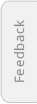
The illustration below shows a comparison between the EUR/USD and the EUR/GBP on a daily chart during the year 2001. Notice how the shadows in the EUR/GBP are relatively larger and more frequent than in the EUR/USD.
Big bodies are very significant and the traders shall pay attention to their direction (or color) and their price extremes. The lower end of a large bullish candle, for instance, is indicative of a price level with a high demand.
As the bodies get smaller the sentiment weakens and the direction becomes less important. That is why very small bodies do not carry any significant color bias.
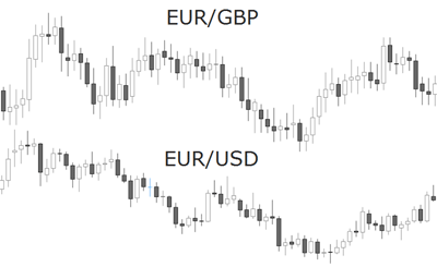
Marubozu candles for instance, being the maximal expression of a large candlestick, indicate a noticeable difference between the price at the time the session started and the price at which it closed. The fact that there are no shadows present in the body shows a unidirectional imbalance in supply and demand.
Any large candlestick pattern represents a significant price movement and also a clear market sentiment. Since the size of the body's extension is subjective, as a general rule, in order to be considered long, the candlestick real body should have a length at least two times the average real body for that pair and time frame.
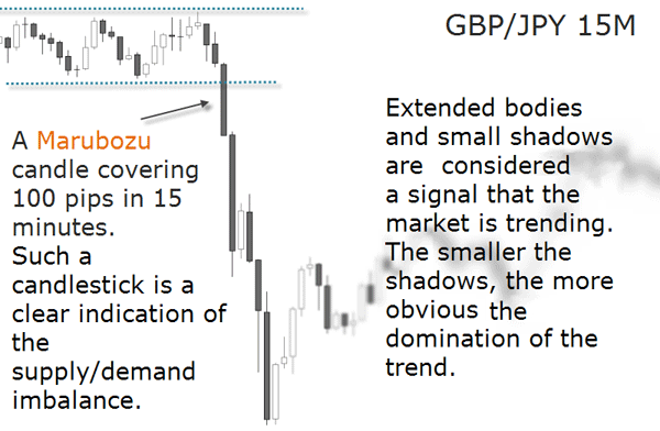
Always wait for the candlestick to close before pulling the trigger to enter a trade. Besides the vast information candlesticks contain, they can also offer a huge help in the decision making process. Many reasons can lead a trader to experience hesitation as to when to enter a trade: a lack of confidence in their analysis, not enough accumulated experience, or being frozen in their thinking because of conflicting emotions of fear and greed. The trade may also be sabotaged by the trader's impulsive will to pull the trigger to early.
To get around all these obstacles, candles offer a level of objectivity absent in other chart types. Knowing that a candle pattern is only confirmed when the candle session is over, the trader has an imperative reason to stay out of the market and wait for a confirmation. Once the signal criteria is met, the trader has an objective reason to enter the trade.
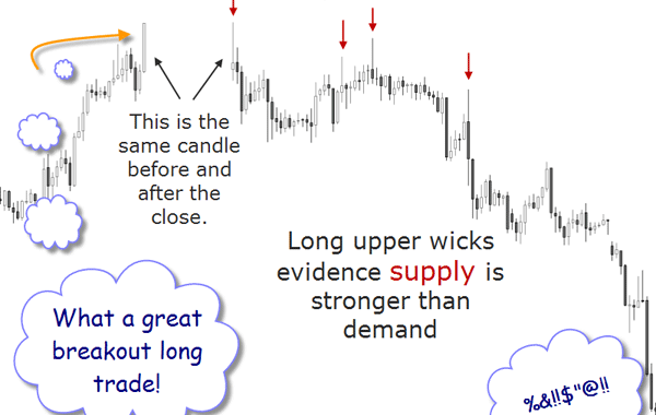
Even if the trade is initially decided because the pattern is evident, waiting for the closing of the confirmation candle will build confidence and train the trader to only take high probability signals. The illustration below shows how a clear trend can change its appearance in the last moments of a candle's lifespan.
The relationship between the shadow and the body is therefore more important than the body or the shadows themselves. Let's specifically address the formation and implications of candles with long shadows and small bodies. A good example of the importance of the shadow in relation to the body is the difference between a hammer and a hanging man: their bodies are equal. What differentiates them is the position of their shadows.
We mentioned before that the shadows, or wicks as they are often called, tell a story about the sentiment of market participants. They represent the price extremes (high and low) of the trading session. As you know from the previous chapter, price extremes are a reflection of market sentiment. Because they reflect the market's sentiment and volatility, shadows play an important role in chart analysis.
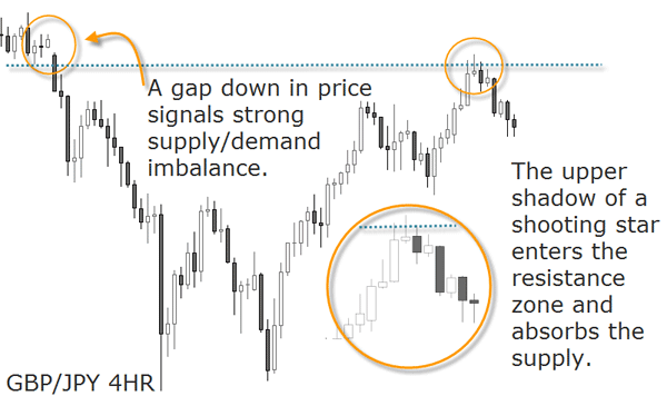
When one - or more - long upper shadow(s) form(s) after a price rally, it is an indication that the market is reaching a supply level. For this reason they are sometimes referred to as bearish shadows.
These long upper shadows are a warning sign that there may not be enough demand at higher levels to continue to propel the exchange rate upward. Although the exchange rate is reaching higher highs, it has closed well below those highs. This is especially evident near an overhead resistance area where supply exceeds demand. These tails suggest that buyers are now taking profits on their long positions and bearish traders may be initiating short positions. This is a clear signal of sentiment shift.
The chart below shows an example:
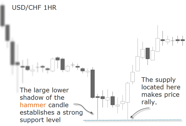
Conversely, when one - or more - long lower shadow(s) form(s) after a price decline, the trader should be forewarned the market is reaching a bottom, which is synonym of demand. Long lower shadows may be referred to as bullish shadows.
Long lower shadows warn that lower prices are being absorbed by a potential demand. Even though the pair is making lower lows, it closes well above those lows. This usually occurs near an area of support on the chart suggesting that sellers are covering their short positions (taking profits) and bullish traders are entering long positions. The below chart shows some examples:
In an interview to Steve Nison, he answered the question “What do candlesticks reveal about the psychology of the market?”:
I look at a candlestick chart as if it’s an x-ray of a market’s supply and demand dynamics. A tall white candle means the market opened near the low and closed near the high, which suggests the bulls are in control. On the flip side, if you have a long black candle, the bears are in control. If you have a spinning top and a small real body, there is more a tug of war between the buyers and the sellers. If you have a doji, the market is balanced between the bulls and the bears, and you don’t want to see that during a rally. What you want to see are tall white candles, not spinning tops or dojis. A doji really reflects indecision and at that point the market becomes tired.
One thing to keep in mind is that sometimes a little knowledge is a dangerous thing. I would caution people against trading with candles until they are very familiar with them. For example, the doji is a potential reversal signal, but one of the rules I have is that the high of the doji represents resistance. If the market closes above that resistance area, the market is “refreshed,” as the Japanese like to say. There are a lot of fine details. As a general rule, dojis represent indecision, but they are better at calling tops than bottoms. There is a saying that the market will fall under its own weight. So if you see a doji during a rally, the market really doesn’t know what it wants to do and it is possible for it to fall under its own weight.
But if you see a doji during a rally, the market really doesn’t know what it wants to do and it is possible for it to fall under its own weight.
But if you see a doji during a downtrend, the market very often will continue down. There are many details you can pick up from looking at thousands of charts.
Source: “Candles shed light on the market”, interview with Steve Nison, Active Trader Magazine, 2003
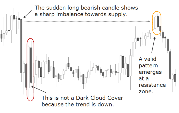
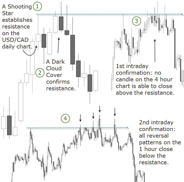
The image below shows an example of a fine nuance in the interpretation of a dark cloud cover. The information we could gather about market sentiment is only valid if all the recognition criteria has been met - otherwise a misinterpretation could lead to a wrong decision.
When trading live though, the candlesticks patterns are not always evident for the untrained eye. The reason we insist on the importance of the candlestick construction is this: before a long lower shadow candlestick is formed, it is first a long bearish candle in the form of a solid marubozu. When facing such a candlestick in real time, it's clear the sellers are in control of the exchange rate and the atmosphere is very bearish. It's easy to become impressed by the potential gains behind the price movement, and entering impulsively in the direction of the move.
What happens most of the time is that the inexperienced trader will sell at a support level. The mistake becomes evident when professional buyers start opening long positions, and the professional sellers covering their short positions. This combined action will put upward pressure on price. As a result, price starts to rise and a lower shadow begins to emerge.
By the end of the session, what was previously a marubozu is now a hammer.
The new confirmed pattern will cause concern to many of the sellers who still have their positions open, and they also may start covering their positions. The price rallies and subsequently additional short coverings from sellers add fuel to the rally. The patient trader will trade based on the hammer signal and go with the new emerging sentiment.
Candlestick analysis applied to the Forex market puts less emphasis on the psychological relationship between opening and closing prices of the daily session than other markets. The opening moment is a key point in a market which closes overnight and it provides the first clue as to the direction of the day. Overnight information can influence trader's sentiments and the more anxious the traders feel, the earlier they will start to trade. A similar emotional decision making process will be found at the close of the day in anticipation of the market direction for the next day.
In Forex though, candlesticks have a structural weakness: because of its 24 hour trading activity, there is really no opening and closing of the day as in other markets. The only closing day is Friday, and many traders agree that this is the day of the week where most emotional trading is seen. While some traders will trade because they missed a good opportunity during the week, others will try to make up what they lost during the week. The resulting whipsaw swings can be devastating for the new trader if you don't know what happens behind the scenes.
A candlestick may show different sentiments during its formation, specially candlesticks of large duration like the daily or weekly charts. If you want to become aware of the emotional states the candle goes through, start to assess your own feelings when you see the market moving. In most cases, your first emotion will be that of the crowd. Be aware of it.
Then, try to stalk the other side of the current market sentiment: who would enter against the current market move and what motives these participants may have. These are usually the professional traders - they act differently from the crowd. Soon you will be able to recognize who is entering based on emotions and who is entering based on objective analysis.
Specially in short-term trading, it is critical for the trader to have a clear understanding of what other traders are thinking. One way to read the market's sentiment during the 24 hour Forex session is by observing what happens between the opening and the closing of the daily candle.
Intraday Candle Signals
As mentioned before, when speaking of the opening and closing moments of the Forex market, we may stumble into a structural problem because this market never sleeps. But there is another way to read candlestick charts consisting in dissecting the patterns in smaller inter-period candles.
For example, you can take snapshots as to what is happening at the formation of a hammer going several time frames lower. These cross-sections of trading patterns is a way of getting additional insights as for the validity of a pattern.
Probably the most frequent case study is that of a breakout. While witnessing a breakout on the 240 minute time frame, inferior time frames will show the strength of the price action as seen on a higher chart. The breakout will be the same on both charts, but the smaller one can show if the candles are closing behind the broken level, or if they are retracing back to close inside the range. The first scenario would suggest that the level has been successfully broken, while the second scenario could be just a testing of the level.
Another important aspect, as suggested in previous chapters, are hidden support and resistance levels on smaller time frames. These levels can become evident with the emergence of typical candlestick patterns as their validity doesn't change across any time frame. Smaller time frames can be used as additional field to get insights as to what happens on a higher level. Specially swing traders, who profit from the ebbs and flows of the market, may find useful to detect patterns on smaller time frames. These patterns can be seen as advanced signals to be finally confirmed on a higher chart. For example, they can tell if there was a successful test of an earlier support or resistance level. The below chart shows an example:
Another interesting aspect is to know at which time of the duration of the superior candle did the biggest movement took place. This way you can assess if the market is overextended or if it is a solid trend. We will cover that through a concrete example in the next section.
But there is another critically important aspect besides the relationship between opening and closing prices and its emotional reading: the trending context. A shooting star and an inverted hammer can also look alike, it all depends where they emerge, right?
Contextualizing Candlestick Patterns
A large candle leaves no doubt of the market sentiment, at least for the duration of its period. But depending on the scenarios where such a candlestick may form, it may have different meanings or no meaning at all.
A long bearish candle may form in the context of an uptrend and signal a potential reversal to the south or an opportunity to buy at a better price.
A long bearish candlestick may also form at the end of a downtrend and signal an extreme market sentiment and therefore a potential exhaustion move. But it can also be an opportunity to sell at a better price.
How can we know if the candle signal has high chance to work out?
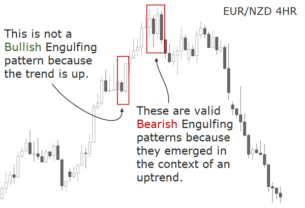
It is important to realize that candlestick formations occur within a specific context. As we have seen before, most candlestick signals are reversal patterns - they suggest that price will reverse its current direction. For this reason a pattern can only be qualified as a reversal signal, if the prior price action shows a clear trend.
A bearish engulfing pattern, for example, must come during a rally not during a downtrend.
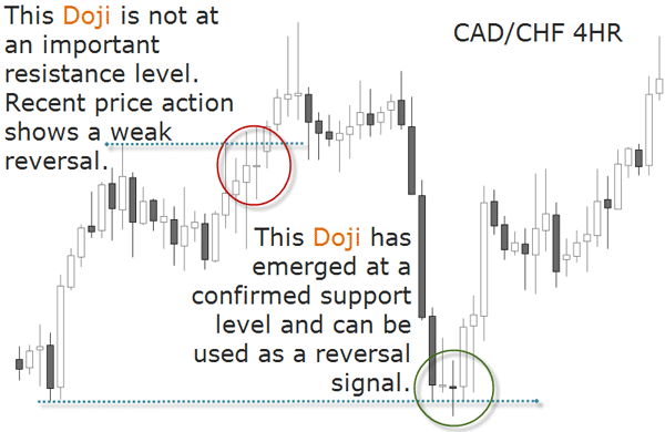
In the below example we see a doji emerging in an overextended market and another one in a lateral market. In the first case the Japanese would say the market is tired — and that’s a potential reversal signal. In the second case the candlestick isn't able to point a direction. Therefore, never trade a doji in a lateral market.
Also of interest are long legged dojis that came after a tall bullish candle or a clear uptrend. This kind of doji session, where the upper and lower shadows are extremely large, is itself a warning that market has lost its sense of direction.
Answering the question “What advice can you give about trading more effectively with candlesticks?”, Steve Nison explains how he confirms the trending context:
One of the things I would suggest is to always consider the major trend. How someone defines the major trend is subjective. Some traders will look at a moving average — if a stock is under the 200-day moving average, they’ll say the trend is down. Personally, I keep it very simple. If the market is making higher highs and higher lows, the trend is up; if its making lower lows and lower highs, the trend is down.
Once you have the major trend, you want to think about initiating a new position in the direction of that trend. If the major trend is up, I’d be looking for bullish candlestick signals to buy on corrections. For example, if there is a bullish hammer and the major trend is up, I’d consider going long on that hammer.
Source: “Candles shed light on the market”, interview with Steve Nison, Active Trader Magazine, 2003
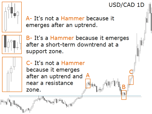
The next chart shows a hammer, remember, a candlestick with a long lower shadow and a small real body near the top of the range. This candlestick is only considered bullish if it appears during a downtrend – otherwise it will not be qualified as such. Such a candle line is called a hammer since, supposedly, the demand at the bottom becomes so strong that the price can not break it.
But there is one variation to trade based on hammers: when they follow a downtrend they are considered a bullish reversal and when they follow a short-term downside correction within a larger uptrend, they can be considered a continuation signal.
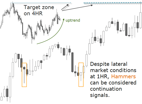
If you are a more aggressive trader and speculate on the trend corrections, a hammer in the context of an uptrend correction may signal that the trend is about to resume and that short positions should be covered.
The image below shows that if you search for hammers arbitrarily, you will certainly lose your edge, as many of them will appear out of context. Here is a hammer in the context of an uptrend:
The same is valid for the mirror image of the hammer, the shooting star. Shooting stars are bearish reversal signals but they can also be considered bearish continuation patterns in the context of a major downtrend. For more aggressive traders, a shooting star is useful as a warning to start liquidating long positions in a downtrend correction. Remember what we studied when we covered the Wave structure of the market in the last chapter: trends are made of retracements.