3. Dejá Vù With Patterns
Price patterns are like stories on a chart the same way as the Elliot waves display a narrative on what price action is doing. They tell you where the price is coming from, how long it has been in that condition, and through the price magnitude and the speed, they also evidence the predominant emotional state of the market. They are visual representations of crowd psychology as waves are because in a way they are also made of waves.
But besides their retrospective usefulness, patterns’ most interesting attribute for the trader is that they indicate what are the most possible outcomes, or “endings” of the story they are telling.
When you see a price pattern starting to form on a chart, you know which boundaries the pair can move. In most of the cases a pattern is a sign of a slowdown, or consolidation, at least in that time frame. By recognizing it, the trader can take a step back and evaluate what may happen to the pair under observation. What you don’t know as a trader is whether the currency pair is going to break out of the congestion and continue moving in the same direction, or if the pair is going to turn around and change direction. But this should not be an inconvenient, because specific patterns show likelihood to unfold in a certain way, offering the trader a positive win probability.
Moreover, being the pattern a measurable chart formation, it can also offer the potential size of a move, indicating what the risk/reward ratio of the trade is. We shall cover the issues on probabilities and risk/reward ratios more in detail in Unit C. For now, let's concentrate on the main elements of all price patterns:
- The prevailing trend: this is the “old” trend that the currency pair has been showing prior to entering the consolidation and forming the price pattern.
- The consolidation range: this is the proper pattern as defined by the support and resistance levels constraining the price pattern.
- The breakout point: naturally enough, this is the point at which the currency pair breaks out and leaves the consolidation range.
- The new trend: this is the trend that the currency pair establishes once it is out of the consolidation zone. It can be in the same direction than the prevailing trend or in the opposite direction.
James Chen keeps you well informed on the most tradable patterns on a daily basis on his FX Path blog at FXstreet.com.
The last element listed above brings us to the two major categories of price patterns: “continuation patterns” and “reversal patterns”.
Continuation patterns, also called “trend following”, tell you that the price is keeping the same direction than the prevailing trend and reversal patterns tell you the opposite: that the price is going to reverse directions and move against the prevailing trend.
Continuation Patterns
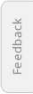
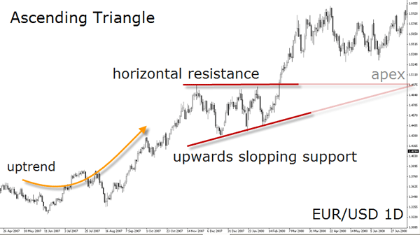
- Ascending and Descending Triangles
When traders try to exploit breakouts as a frequent feature of price behavior, they often face the negative effects these events may lead to. The so-called “false” breakouts may happen too often when the trader is not able to envisage the crucial price levels. Triangles are one of the chart patterns which guides traders to identify which support and resistance levels are determinant. Ed Ponsi invites the reader to have a closer look at intraday breakouts:
“Ascending and descending triangles are excellent breakout patterns, because the pattern itself establishes a directional bias for the trade. An ascending triangle is formed by a combination of diagonal support and horizontal resistance; a descending triangle is formed by a combination of diagonal resistance and horizontal support. In the case of an ascending triangle, the bulls are gaining strength and buying at higher and higher levels, while the bears are merely trying to defend an established level of resistance. In the case of a descending triangle, the bears are gaining strength and selling at lower and lower levels, while the bulls are merely trying to defend an established level of support.
In the case of ascending or descending triangles, the trader can gain an edge by looking to the direction of the currency pair prior to the formation of the triangle pattern. This is because it is not unusual for currency pair to trend, then consolidate, and then resume trending. The directional bias of a triangle is to break the horizontal support or resistance, and if the pair was trending in the same direction prior to the formation of the pattern, the trade becomes all the more compelling.“
Let's take a closer look at the case of an ascending triangle. This pattern is usually constrained by a horizontal resistance line toping the relatively equal highs, and an up-sloping support line connecting the lows moving higher with each dip. The ascending trendline predicts a rise in prices as fewer sellers are found at lower levels. Both lines converge forming a triangular pattern, hence the name. The top horizontal line should have at least two contact points with price. Similarly, the up-sloping trendline should be traced using at least two minor swing highs.
Triangles happen to be one of the most common price patterns in Forex and there are traders making bundle of money only trading this formation. Finding an ascending or descending triangle on a chart is quite simple. This also means that if you see such a formation on a chart, other market participants are probably seeing it as well. This is not bad at all, it will even confer more probability to the unfolding of the pattern. Being an easy pattern to identify, it's also easy to confer your findings with other analysts. Make sure you follow our bloggers at FXstreet.com as most of them display chart patterns on a regular basis. If other traders or analysts are not seeing the same pattern as you, it’s probable that the pattern will not unfold as you expect.
The ascending triangle is a bullish pattern in an uptrend for a continuation to move higher but can be considered as a reversal in a downtrend.
When trading with ascending and descending triangles, the risk can be controlled by placing the stop under the most recent bottom, on the outer border of the formation. There may be premature breakouts in which cases price would return to the inside of the formation and not surpass the support trendline.
Usually price does not stay in the congestion till the apex of the triangle, and breaks out when two thirds of the pattern is formed. Once the exchange rate pierces the horizontal resistance level or even breaks out of the formation, it is common to see a pullback (or “throwback”) to the broken level.
The shape of the triangle suggests how far the move will lead: in order to measure the potential move after the breakout, take the height of the pattern and add that measure (in number of pips) to the horizontal price level at the breakout. To take the height of the triangle you have to subtract the exchange rate in the lowest point of the pattern from the high at the start of the formation. The result is the minimum potential and suggests the potential “target zone”.
Note the dynamic is the same in both types of triangles, ascending and descending, but in the inverted direction.
In a descending triangle, the swing highs are like a ball bouncing on the floor making successive lower highs, and the horizontal level is made of equal lows acting as support. In an article about patterns written by Teresa Appleton and published in the Trader's Journal we can read:
“The rally or upside market move is falling short of momentum and retests the support line at the low of the triangle. The highs form a downward slant while the lows remain flat. After the first high in the triangle, the market moves back to test support igniting buyers from the test of support. The market rallies only to make a lower high. Fewer buyers step in on each subsequent test of the support.
[...]
The descending triangle acts as a continuation pattern in a downtrend but as a reversal pattern in an uptrend. It is best to view it as a consolidation pattern. There is small risk involved with triangle formations because the stop is located just over the last peak.”
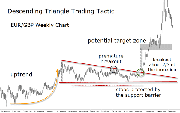
- Symmetrical Triangles
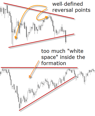
This pattern appears when the exchange rate starts to print lower highs and higher lows representing a price consolidation with progressively diminishing volatility. The two trendlines bounding the formation converge into a triangular shape. The trendlines don’t always have the same length and therefore the symmetrical triangle can sometimes be tricky to identify. In any case, those trendlines should manifest their status as support and resistance lines showing at least two reversal points each one. In other words, the price has to touch the lines at least on two occasions.
Make sure that the reversal points are accentuated - if you have any doubts about what a true reversal is, please revisit the Chapter A04. If the price is hooked to one of the lines or is reverting at one of the lines slowly in a kind of rounded bottom or top, be careful because this may not be the best set-up for a triangle.
The below daily chart of USD/JPY in 2008, is a pretty good example of a symmetrical triangle.
Triangles are usually considered continuation patterns, but do not always play this role. They can sometimes reverse a trend. In any case, triangles are made to be broken. Any true break of a well-formed triangle should be considered a significant technical event and presents a solid potential trading opportunity.
Symmetrical triangles can occur when the price is trending up or trending down and their length of time depends on the time frame. The triangle is called “symmetrical” because the angles of its lines to the horizontal are quite similar, however this is not a prerequisite.
You often hear analysts label this as an ‘indecision’ pattern. The lower highs and higher lows create a completely sideways market suggesting participants are not interested in entering neither long nor short.
To see an example of a symmetrical triangle explained with Elliot waves, see Pierre Charleboi's post titled Are we going to break the top of the channel and complete a Triangle?
The chartist theory states that in a downtrend the break is downward and in an uptrend the breakout is upward. But some analysts prefer to classify it as an indecisive pattern as for a directional move. They suggest waiting for the pattern to work out before taking any action.
The triangle pattern has a relatively narrow risk because of the closeness of the stop loss orders. Be aware of a false break out and an eventual snap back, in which case a use of tight stops on the outer border of the formation should help to protect your position if that event occurs with the pattern.
Each pattern has a specific spatial profit target area and stop losses are generally set in the same manner as for all other breakout trades - on the opposite side of the break or of the formation, where the reasons for the trade are no longer valid if reached.
In order to find the target zone, follow these simple steps:
- First, measure the distance from the highest reversal point to the lowest reversal point inside the formation, then add this difference to one of the points depending on the direction of the breakout. If the breakout is to the upside, then add the difference to the highest point in the formation, and vice versa in the case of a breakout to the downside. It's not rare to see the apex of the triangle acting as support or resistance after the breakout.
- Second, since the pattern is not reliable to determine in which direction it will unfold, wait for price to breakout and pullback close to the triangle line to enter the position.
James Chen explains in his webinar High-Probability Forex Pattern Trading how to place stops and profit targets with the main chart patterns.
- Flags and Pennants
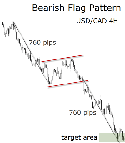
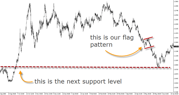
Flags are considered a market pause prior to a continuation move. An impulse move to the upside with a slight downward/sideways pause is called a bullish flag formation. In the context of a downtrend, an impulse move to the downside with a slight upward/sideways pause is called a bearish flag formation. On a chart, both formations appear like a short rectangle (or channel) usually bounded by two parallel support and resistance lines.
Pennants are like a flag made of a triangle. The impulse movement, much like in the case of flags, forms a tight little symmetrical triangle to break and continue the primary direction of the trend. In this pattern, the two lines converge slightly upwards in a downtrend and slightly downwards in an uptrend, but exceptions can obviously be found.
Flags and pennants look similar and in many ways they unfold alike. From a trading tactic perspective, the target zone of this chart pattern is calculated projecting the length of the prevailing price movement before entering the congestion to the breakout point. To get the length of the move, pick the distance from the last valid swing low (in uptrends) or swing high (in downtrends) before the extended move and the pattern. Protective stops can be placed on the outer border of the pattern where the set-up would be no longer valid if price reaches it. If you prefer a more aggressive approach, the stop can be placed inside the formation, but in this case it will be more vulnerable to premature breakouts.
Before attempting to measure their potential price target, make sure there are no other strong support and resistance levels in between which would make the price stop and reverse. Although these formations offer an extraordinary risk to reward ratio, it is always wise to apply your discretion when making use of any charting tools. More often than not the potential price zone is not reached. As always, we suggest that any scenario with risk to reward of less than 1:3 is not worth trading.
Both types of formations are short on duration signaling a big unbalance between buyers and sellers. These formations are very powerful but because of this attribute, they are much easier to recognize retrospectively than in a real market situation.
The “Flag” chart pattern by Sunil Mangwani is a webinar dedicated to this one chart pattern and all its nuances. Sunil is an expert when trading with chart patterns, make sure you get to see all of his recorded webinars.
Usually, flag and pennant trendlines slope upwards in a downtrend and downwards in an uptrend, that is, against the main trend. But as mentioned before, flags and pennants can be horizontal too. They appear most of the time after an explosive and large movement in the exchange rate, or after a steep price trend. In Elliot Wave Theory terms, a flag or pennant could perfectly be a wave 4 after the completion of wave 3. The so called “flag pole” would be wave 3 and the flag itself wave 4. This could be the explanation why they typically move against the trend as wave 4 is a corrective wave.
For identification purposes though, the most important guideline is the rapid price movement forming the flag pole.
Don't jump the gun! This advice is essential to survive in the first years of your learning curve.
Inexperienced traders (and sometimes experienced as well) often assume that the breakout of a chart pattern is a perfect entry. Many times this is not the case. Don't be fooled by what you see, since everybody is seeing the same as you - provided that you have acquired a certain ability to find the patterns. Considering that the most part of the retail traders lose their money, we can assume that the market will find ways to wipe out the majority of traders before resuming a trend.
Again, confer with other analysts that you are seeing the same pattern. And above all, wait for the pullback after the breakout. By now you know that the market moves in waves, that means that price comes back most of the times. If it comes back most of the times, this gives you an edge to enter at much better levels, and specially after the majority has been stopped out. At this point, you should be looking to pull the trigger.
Pierre Charlebois tells in his blog what he does to avoid impulsive trading:
"There are two voices I my head whenever I trade. One saying: Don’t miss the big move. The other says: Don’t jump the gun. So which one do I listen to? Well… both I guess. What I have learned over time (and am still learning to be better at) is that I have to be sure when I pull the trigger; that my emotions aren’t dictating my trading.
When I trade emotionally it’s because I am trying to make up for an earlier loss or lack of a gain where I missed a very good move. Both of these sentiments can get me into trouble.
In order to combat this, I pre-plan my trade and then wait for the trade to come to me. This is where I make the best and most consistent trades. Right now, I have to keep telling myself that a turn is coming and it will be strong. AND it has not started yet and I must be patient and wait.
This is definitely one of the hardest things for me to do. “Waiting” is not my nature as I always feel like I will be missing something. As a teacher of mine once said: Trades are like busses. There’s another one coming around the corner.
So don’t jump the gun and move back into the market when a turn is evident.”
- Wedges
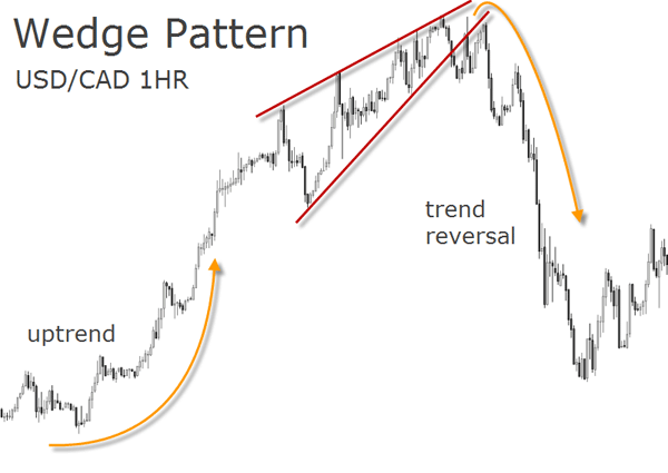
"I received a question about the differences between triangles and wedges, so I just wanted to write a quick post about it. Much like symmetrical triangles, wedges are generally larger chart patterns that are characterized by two converging lines. But unlike the lines of a symmetrical triangle, which slope in opposite directions, the two sides of a wedge will both slope in the SAME direction (up or down) at different angles. Therefore, a rising wedge will have two converging sides that both slope up, while a falling wedge will have two converging sides that both slope down. Falling wedges after uptrends are usually considered bullish continuation patterns, while rising wedges after downtrends are usually considered bearish continuation patterns. Other wedge scenarios are generally taken on a case-by-case basis. Trading signals, like with triangles, are triggered on the breakout or breakdown of the wedge. In the Forex market, wedges occur on a relatively frequent basis."
James Chen's description should suffice to alert the reader that we are facing a triangular formation which is however not classified as such. As additional identification guidelines we can add that the support and resistance lines shall always have an inclination and not be parallel to the time axis. Remember: if one of the lines is horizontal, then you are seeing a triangle.
In case of a wedge the lines must eventually intersect but note that this pattern's main characteristic is the elongated shape - more than any of the previous mentioned patterns.
Another characteristic is the number of contact points which shall be also higher than two because of the relatively longer lifetime of the formation. Be skeptical if there are only few contact points at the support and resistance lines. Ideally, the wedge has to show a well distributed price action inside its borders. This, by the way, is something you want to check in all formations: too much “white space”, literally space where the price did not go through on the chart, is not a good sign.
Usually prices break out of the wedge at about two-thirds of the length of the formation - from the start to the eventual apex, the apex being the point were both lines meet. They are quite common, not so easy to find, and can occur at any time during the trend. But in most cases expect them to happen at the end of a long trend. James Chen mentions above that there are “other case scenarios” for wedges, and the following edge shall display one of them.
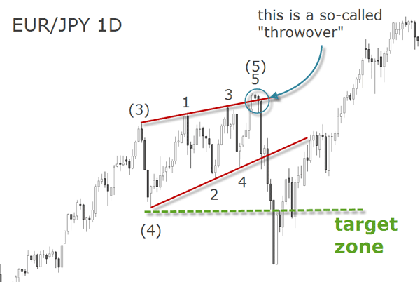
In the previous section Elliot Waves in a Nutshell you came to learn that some impulse waves are called diagonals, do you remember? This is where you expect to find most wedges: in the fifth wave position especially when wave 3 has been exceptionally strong. Therefore, wedges have their converging lines pointing in the same direction as the main trend.
As mentioned before, expect premature upside breakouts (in uptrends) or downside breakouts (in downtrends), before the real reversal breakout occurs. These breakouts are the result of the unfolding of wave 5 inside the diagonal wave (or wedge).
In his blog, Ross Yamashita is continuously scanning a lot of pairs providing analysis where he combines chart patterns with Elliot Wave principles. He focuses specially on the "Ending Diagonal" reversal pattern, so you definitely don't want to proceed without having a look at it.
Taking the ending diagonal trading tactics into account will save you from the usual retracements. The chart below illustrates a wedge where price breaks down but finally reverts. The optimal target zone though is the origin of the diagonal pattern.
Did you know that a book titled "Profits in the Stock Market" written in 1935 by H.M. Gartley, the creator of the Gartley Pattnern, was originaly sold for 1,5000.00 USD? Today you can get this book for 120 USD but its effectiveness is still as powerful as before.
In his webinar My Favorite Patterns To Trade, Derek Frey explains the Gartley Pattern in much detail and among many interesting tips he also shows how you can experiment chaos theory with the help of an excel file.
- Trend Reversals
Though the Forex market is prone to trending, it’s also known for sharp reversals. By now, you should already be very skeptical towards the concept of “trend” and eventually more inclined to adopt a contrarian approach.
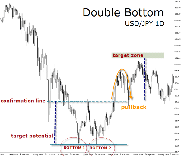
Seeing the market as an unfolding of waves has taught you that what comes down will probably go up, and often in a dramatic fashion. This is the case of double bottoms.
- Double Bottom and Double Top
A double bottom is a sharp fall in the exchange rate followed by a rally and another sharp fall to the previous levels, finally concluding with another rally. It looks like a “W” on the chart. The same flip upside down is a double bottom, looking like the letter “M” upon completion. These patterns are easy to identify but quite difficult to trade because of the low risk to reward ratio they sometimes offer.
The following chart clearly illustrates a double top formation. After a prolonged uptrend to all-time highs, the EUR/USD pair formed the first top at around 1.6000. A rapid retracement was quickly followed by a retest of the previous resistance, creating the second top, hence the name. After that, the pair precipitated downward changing the direction of the trend.
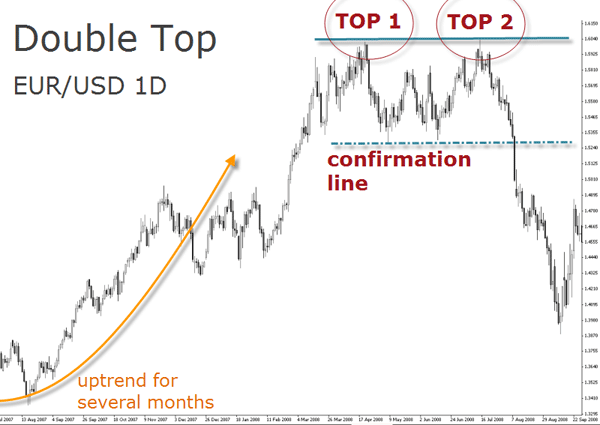
Finally, the pattern and change of trend were confirmed after the pair breached the confirmation line level around 1.5300.
The two well-defined peaks (or bottoms) have to be relatively close in terms of price and time, so that the pattern can be classified as such. The double top occurs after an uptrend and indicates a possible reversal or that the uptrend is at least leveling off.
The double bottom occurs after a downtrend, indicating a possible reversal as well.
The target zone for a double bottom, for instance, is the distance from the support level to the confirmation level projected to the upside from the confirmation level. Traditionally, the confirmation level is defined by an intermediate swing high reached between the two bottoms. Until price surpasses the confirmation level, the pattern remains unconfirmed, hence the name “confirmation level”. A close above the confirmation level signals a breakout.
Should you enter the trade immediately after the breakout? We would suggest not to. Since the distances between the support of the pattern and its confirmation level is relatively large in most of the cases, don't expect the price to continue rising without a pullback to the breakout level. After all, the pullback is your friend, not the trend!
There are other guidelines as to the trading tactics which differ from the traditional ones. Usually it is considered more aggressive to enter at the second test of the high, with a stop loss placed over the high (in a double top). But many times this is just the best risk to reward setup.
The traditional method described above, using the confirmation level as the breakout level to enter the trade, is often considered conservative. But considering the stop loss order is placed above the previous highs (in a double top) or lows (in a double bottom), then the risk to reward is not attractive anymore.
Therefore, after you locate a potential double bottom or top, review the previous supply and demand clusters before entering the trade.
These patterns typically occur after a prolonged trend that takes the market to price extremes, otherwise it can not be considered an optimal condition for a reversal pattern. Make sure this condition is met to avoid surprises with false unfoldings.
A retest of a low level may lack the buying enthusiasm to revert the trend, and instead of continuing upward, the exchange rate can throwback to the support level, break it and resume the prevailing trend.
If prices drift below the support zone (in a double bottom) or above the resistance zone (in a double top), then the pattern is no longer valid. Note we are using here the term “zone” rather than “line”. Please refer to Chapter A04 if you have any doubts distinguishing S&R zones from S&R lines.
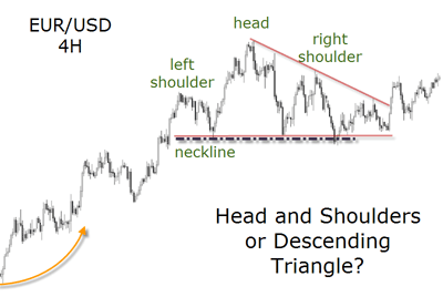
- Head and Shoulders
Along with the double tops and bottoms, the head and shoulders are perhaps the most popular chart formations. This is due to their reliability and to the fact they are easy to recognize. The characteristic three-rounded tops with the higher bump in the middle (the “head”) make the formation easy to spot.
The confirmation line has a fancier name: it's called the “neckline”. The neckline can be horizontal or slightly sloping up- or downwards. As for the angle of the neckline we have no statistical evidence that the slope and direction of the line can be a predictor of the severity of the price decline or not. In any case, the angle of this support line has to be small.
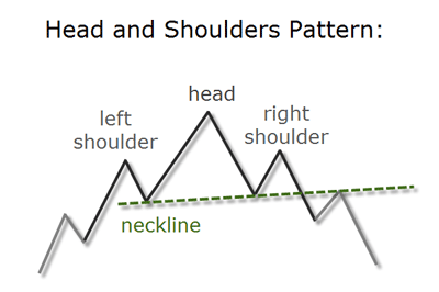
The head and shoulders pattern is a great example of resistance levels turning into support and vice versa. The same with its sister pattern, the so-called “inverted” head and shoulders.
The pattern develops with the exchange rate trending up and forming the left shoulder on a reversal - perhaps a rounded top formation. Then the market trends higher to form the head and falls back to the same support of the first shoulder to form the right shoulder. The neckline is thus the line connecting the troughs between the peaks. If it is broken, expect a downside move to occur.
There are variations of the pattern, with identification guidelines different from the classical formation. This reversal pattern can appear in a variety of shapes such as a central head with four shoulders, which instead of being labeled with some monster name is simply called a “complex” head and shoulders.
The target is measured taking the distance from the high of the head to the neckline, and projecting it down from the neckline break. The neckline is often used as a trigger point to sell (or buy, in case of an inverted head and shoulders).
In an inverted head and shoulders bottom, on the other hand, the middle trough (the head) is lower than the other two troughs (the shoulders). The line connecting the peaks in a head and shoulders bottom, is also called the neckline. Breaks of this neckline are considered long trading signals. Targets for the inverted pattern are measured similarly: using the length from the bottom of the head to the neckline, projected up from the neckline break.
Here too, expect to see pullbacks unfolding after the breakout. You can consider them as the confirmation that the support neckline has turned into resistance, or the opposite in the case of the inverted figure.
We do not pretend to hide the fact that trading patterns is sometimes very tricky. The bellow example of a head and shoulder pattern is clearly conflicting with a descending triangle, which is a continuation pattern. Notice how the head and shoulders pattern was invalidated by the small breakout and price reversal inside the formation.
The webinar recording titled “Spotting Short-Term reversal points”, by Adam Rosen, familiarizes you with technical indicators as well as chart patterns. This presentation will serve you to integrate tools such as Moving Averages, MACD, Bollinger Bands, or RSI with trendlines and chart patterns.
Most people who are interested in trading or the financial markets in general have already heard about the famous chart patterns here introduced. Although this is very basic stuff, it shows how chart patterns can be completely relevant in the Forex markets today.
After reading the Fundamental Analysis chapter before, we invite you to frequently visit Jerry Furst's blog as he brings up chart patterns in their fundamental context.
Feel free to email Jerry First when you see patterns at the “Right Edge” that get your attention - or need clarification.