4. Finding the Bonus Edge
Through this brief section we shall introduce you to some more particularities of the pattern identification process on which you can base your personal trading approach. Finding a true edge in trading is often - as in life - a question of seeing the reality differently than the majority. This section is by no means a deep research work, but it will provide you with ideas that you can further develop on your own.
Fractal Patterns and Intra-pattern Trades
One of the interesting aspects in detecting chart patterns is that the form and proportions are the most important aspects despite the size and time frame of occurrence. This is probably what enables a pattern to emerge inside another bigger pattern on a higher degree, the same way as fractals emerge.
Here’s an example on the USD/JPY for a fractal observation. See how the head and shoulders pattern that emerges in the right shoulder of the bigger pattern is anticipating the same breakout.
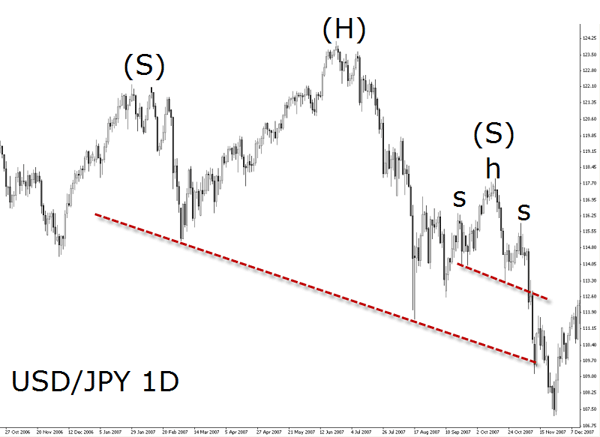
This phenomenon is a good evidence of the market emotional state and illustrates how a sentiment is gaining ground across all time frames becoming the true dominant feeling. Sometimes, like in the above example, the patterns become even smaller but sometimes the opposite can occur: the pattern may expand in size.
This occurrence can be considered as an additional bonus edge as each micro pattern is confirming the higher macro pattern providing great trading opportunities.
Pierre Charlebois, an expert in finding such occurrences, writes in his blog:
“In my last blog I said I would talk about patterns and specifically ‘Fractals’. When I went looking for info on them I found Wikipedia has a fabulous entry that defines this very well. The reason I want to draw this to your attention is because patterns develop on charts based on the emotions of the total group of traders. When we can identify such patterns on the larger times frames, we can then start looking for similar patterns on the lover time frames to aid in identifying continuation and/or reversals in a given currency pair. Have a look at this link and stay tunes as I will then post charts of where such fractals have occurred and how this helps identify great trading opportunities.”
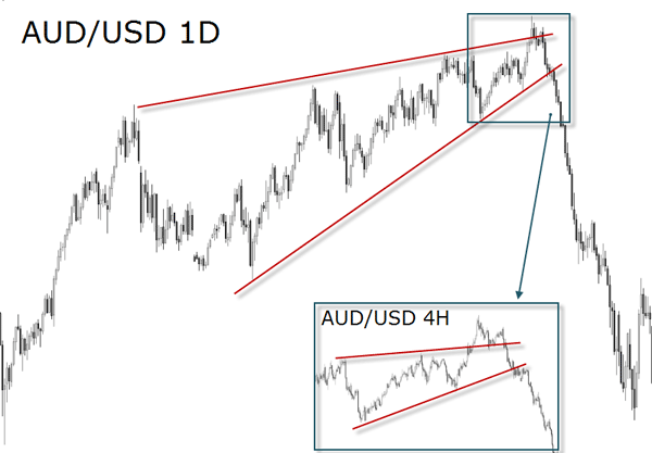
Another example is illustrated by the below AUD/USD wedge pattern:
Triangles Inside Channels
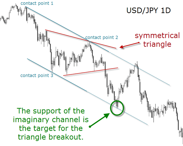
If a triangle is wide and long enough and its ascending (or descending) border line is clearly made of at least two contact reversals, a new parallel line to the horizontal can be traced on the chart to build an imaginary channel. The trade set-up consists in a triangle breakout at the top (or bottom) of an imaginary channel. To get the channel from its beginning, the points you need are contact point 1 and 2 at first. Then you draw a parallel line into point 3, and the channel emerges! This is a very common event across all time frames.
Price and Time
Like for waves, price patterns can be found in any time interval as you already know. The time frame that a pattern is found in should also be the time frame you use to open and manage the position.
Another notable edge when trading chart pattern breakouts is the time of day. Many studies on chart patterns include the volume variable in their trading tactics. This is because most of these studies are focused on the stock market since chart patterns can used in every market.
These studies consider a breakout significant if it occurs on high volume, and less significant if it occurs on low volume. But in the Forex, especially in the spot market, traders don't have such volume figures on a global scale.
In order to solve this handicap, let's recall one of the main characteristics of the spot market as described in Chapter A01: it says that market activity is not equally liquid at all times of the day, and therefore we can anticipate that certain times generate more volume than others. This can used as an edge to the trader's advantage.
Ed Ponsi’s presentation quoted below helps to gain a better understanding of the market and of its optimal trading times:
“Consider that when it is 5:00 PM on Sunday in New York, it is Monday morning in places like Australia and New Zealand. Overall, volume is low at this time of day because the three biggest Forex volume centers – Great Britain, the United States and Japan – are mostly inactive at this time. However, the Australian dollar and the New Zealand dollar (also known as the “Kiwi”) may see some price activity during these hours.
A few hours later, around 7:00 PM Eastern U.S. time, Japan awakens and the Forex markets begin to stir. Japan is the third largest Forex trading center, and comprises about 10% of all Forex trading volume, as many major banks have offices in Tokyo. The Japanese Yen is particularly active at this time, especially vs. the Euro, the U.S. dollar, and the Great Britain pound. Most of the volume occurs during the early part of the Japanese session, and the liquidity lessens considerably as the trading day continues.
As the Japanese trading day winds down around 3:00 AM Eastern U.S. time, European markets open for business, and the London trading day begins soon afterward. Great Britain is by far the most important and influential Forex trading market in the world. The dealing desks for many of the world’s major banks are run from London, and the market is responsible for roughly 30% of all spot foreign exchange volume. London tends to be the most orderly foreign exchange market due to its tremendous liquidity.
About midway through the London trading session, U.S. Forex traders come to life. New York is the second most important market in Forex trading. New York trading is very liquid and accounts for about 20% of the world’s total foreign exchange volume. Trading is especially active early in the New York session, as the London session is still ongoing. U.S. Economic news releases often occur early in the New York session, and can cause a tremendous amount of volatility.
Trading often becomes choppy after midday in New York as the London market winds down, and liquidity and volatility begin to dissipate. By mid to late afternoon New York time, London traders have gone home for the day, and it is late at night in Japan. New York traders, while still active at this time of day, have already finished with the bulk of their trading. Friday afternoons in the U.S. are generally the least active, because for much of the trading world, it is already Saturday.
Finally, as the U.S. markets close, a new trading day is just about to begin in the western Pacific, as the Australian and New Zealand markets begin to stir, starting the process once again. The cycle continues all week, with most dealing desks closed from Friday afternoon until Sunday afternoon, when trading resumes.”
To gather a greater understanding of the Forex market’s liquidity and how the bigger players act during the different times of day, consider visiting Dr. S Sivaraman's blog, Market Readings.
Beyond the intraday tactics, like the session of the day which produces the best trades, the trader may also find interest in seasonality. Seasonality can be considered a behavior pattern that occurs at given times within a calendar year. Finding out if a particular pair shows more action in certain days of the week or certain months of the year can serve as an edge for the mid/long-term trader.
Seasonality is a great resource to analyze the market without indicators, just by looking at price action itself. The best way to incorporate it to your trading is by measuring the range for a particular time period in a certain Forex pair. But do not simply buy or sell because you found out that the NZD/USD performs better in November that in any other month, for example. As an edge, it has to be summed up to other edges in order to provide you with a good probability to trade upon.
Patterns Failures
A failure when trading a chart formation should not be considered as a deficiency of the analysis, but as an eventual edge over the other market participants.
First of all we need to be sure that a certain pattern we want to trade is really a recognizable pattern. Only then we can speak of the possibility of failure in terms of unexpected unfoldings, like false breakouts or the price not reaching the target zone.
For every pattern there are guidelines as to its formation and conclusion, so that you can have at least a standardized guide to help you avoid making wrong decisions derived from false chart formations. The following aspects should help you discard when a pattern is not a pattern:
- To start with, the trader has to examine the definition of a trend and be sure of the market direction. This might sound too simplistic, but sometimes we see reversal patterns when there is in fact no trend to be reversed. The technical definition of a trend is basically: an uptrend occurs when several subsequent highs have printed higher prices while several subsequent lows have also printed higher prices. The inverse scenario is a downtrend: when several subsequent highs have printed lower prices while several subsequent lows have also printed lower prices.
- In the second place of a pattern “checklist” would come the confirmation process. Some patterns have a confirmation level to help the trader in the analysis and the trading set-up. For instance, head and shoulders have a neckline, double tops have the confirmation line, etc.
- Make also sure that other requirements are met such as the angles of the sloping lines in triangles, and more importantly, their direction.
- Another aspect that you want to train your eye at is to check if the chart pattern shows weak price action within its boundaries. Usually, any chart formation must show well-defined peaks and valleys and clear reversals at their support and resistance lines.
If you want to be safe in identifying patterns, the formation should satisfy the previous requirements. Following these simple rules will protect you from accepting anything as a viable pattern. This brings us to the next point: not all recognized patterns are good trade set-ups. But unfortunately, text book guidelines alone are often not the real crux of the matter. The trader has to know the big picture.
Conventional Chart Patterns and Forex is a webinar presented by Sam Seiden where he shows that there is a difference between text book trading and real trading. With the help of several examples the trader is taught how to use chart patterns taking in consideration major supply and demand levels on the left side of the chart. Since all chart patterns indicate a breakout potential, we should always formulate the question: where is the price breaking into?
Many market movements can resemble a double top or double bottom formation. Pay close attention to these formations by checking the pattern development and confirmations thoroughly. Just because the exchange rate tests the same high or low on two separate occasions does not automatically constitute a viable trading set-up.
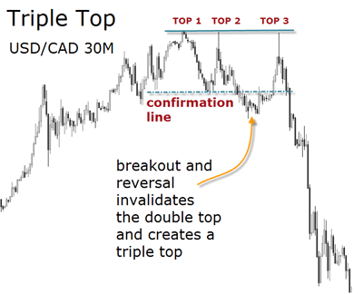
For instance, a double top can develop itself into a triple top formation which is also a potential reversal pattern. A triple top may test the resistance line two times and then cross down the confirmation line and rally back to the resistance to test this area one more time.
The confirmation line breakout is obviously a fake signal and many traders jump short into the position too early just to be stopped out with the subsequent rally. In order to avoid such situation, the trader has to assess the strength of the reversal level, in this case the resistance zone. Only if this area turns out to be a strong level of supply, then the pattern can be taken as a trade opportunity.
Although chart patterns are excellent starting points to develop a personal trading method and useful visual tools, we prefer to insist in what happens behind the scenes. Only that way, we believe, you will gain the endurance of a true discretionary trader. The following quote from Bill Young is an eye-opening description of price action.
“History is a wonderful event. Charting is simply an exposé of History and it can read like a road map, showing exactly where it has been, but more important, the natural areas of human reaction. Let me explain: The market moves up to a certain price point level, stops and reverses and moves the opposite direction for a short time period, then stops and reverses again. In this example, does the market have buying pressure or selling pressure? Is the market in an up trend or down trend? Not sure? Well you’re not alone. Most of the traders in the above example were confused also. Initially when the traders placed their “Long side” trade, they took a position and then placed Sell Stops to protect their position. The market moves downward in the opposite direction of the position triggering the stops. Once all the stops were cleared out, the market lost momentum and reverses. So, now everyone who was initially long has been closed out of their positions. Now for those traders fortunate enough to have been short, begin to cover their positions and take profits, which also begin to trigger the buy stops of those traders who are short when the market reverses to the upside. This process is a constantly repeating cycle. Market moves in the wrong direction, triggering stops. The market then reverses when the stops have dried up and begins to trigger stops in the opposite direction. This is the basis of the saying, “The Market moves to where the stops are located.” Co-incidentally, major swing points or major reversal price points are used as major placements for stop positions. Next time you look at a chart, consider looking at it from this point of view, ie. “Where are the stops located?”. You just may begin to look at charts and what they represent in a bit of a different light. “

Source: Fibo & Pip, FXstreet.com
The USD Index
The USD index (USDX) can be considered an important analytical tool for traders in just about any market. This USDX is actually a futures contract tradable like any currency futures contracts. It can be also traded using ETFs that track the USDX itself. However, rather than trading the index itself, retail traders can use it as a way to analyze the relative strength or weakness of the US Dollar in general.
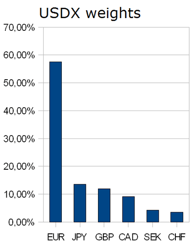
The USDX is a geometric mean weighted index which tracks the USD versus a basket of other world currencies on a weighted average basis. The currencies included are: the Euro, the Japanese Yen, the Canadian Dollar, the Pound Sterling, the Swedish Krona and the Swiss Franc. Each of these currencies is given a weight within the index. Because not every country has the same size, it’s only fair that each country is given appropriate weights when calculating the USDX. These are the current weights:
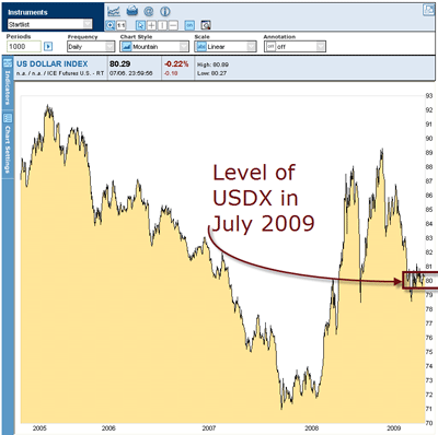
The base of the index was set to 100 at its start in 1973, and its price movements are relative to this base. This means that a value of 80, as you can see in the chart below, would suggest that the USD experienced a 20% decrease in value over the time period comprising its existence.
The USDX can be part of that big picture telling you what is happening to the currencies of the world based on its price action. Its charts provide you with the clues as to where crucial supply and demand levels are, that is, where buyers and sellers are waiting to act in the future based on their actions in the past. This is fundamental information which helps you understand what is going on in the FX arena.
If you want an additional edge, always include the USDX in your analysis and watch for clues as to the sentiment of the currency traders the same way you do with any other currency chart.
If you don't have the USDX on your charting platform, you can always check it here at FXstreet.com.
Here's something interesting: since the half weight of the USDX is given to the Euro, when the Euro falls in value, the USDX moves up. The USDX will often look like an inverse of the EUR/USD spot Forex pair, or a USD/EUR futures contract.
These are the steps Pierre Charlebois follows when assessing the USDX:
"1. I use it to help guide my view on whether the USD is likely to to strengthen or weaken. I don’t trade it specifically (although there may be some ETF’s available).
2. Some chart providers provide a feed so you can view it. But it is an option that not all providers have.
3. I use the same technical analysis as I would on anything I trade.
4. This helps in trading against all pairs where the counter currency is the USD. Such as EUR/USD, GBP/USD, USD/CAD."
For a weekly analysis of the USDX you can follow Trading Metro reports. Or if you prefer, visit the blog of one of its authors, Pierre Charlebois, for USDX charts analysis with patterns and waves.
Round numbers
If humans would have two shoulders on the left side and only one on the right side, you can bet the classical pattern would be the double-shoulder and not the head and shoulders as we know it.
Can we say the same of round numbers? Is it because humans are born with ten fingers and ten toes that we are so obsessed by round numbers?
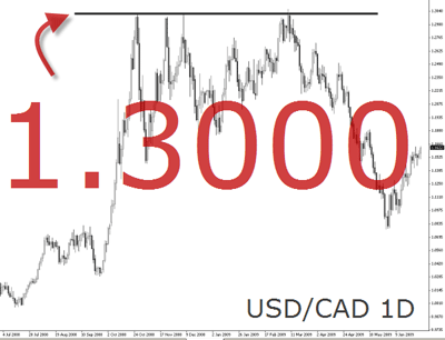
Yet the truth is that market participants show a tendency to place buy and sell orders on numbers ending in zero. Because of this inclination, certain price levels may, at times, evidently produce considerable resistance or support without any reference to a previous significant price action at the same level.
Prices ending in “0”, “00”, or “50” became effective support and resistance levels, especially if that level represents an historical high or low and no past levels can be used as reference. But it is also frequent to witness the round number reaction if a certain round number has not been visited for a relatively long time.
The price action that takes place at round numbers reflects the vast quantity of orders congregated at that level. Why a trader expecting the EUR/USD to reach 1,5500 will buy the pair when it crosses 1,5450 and not 1,5445? This proves that support and resistance levels contain a psychological element as well. They are not arbitrary levels on the chart - they exist first in the traders’ minds, and second in the real market through the congregation of orders around these levels.
When tracking the waves and the exchange rate oscillation, make sure you take a closer look at price reacting to the round numbers.
While we can not give you the experience needed to make money in the Forex using chart patterns, we can give you the tools and say: “observe and practice, observe and practice.” This is the foundation when developing a personal trading style to operate with in any market.
Chartist price patterns will improve your ability to identify crucial support and resistance levels, and these will, in turn, allow you to maximize your risk to reward ratio. You will look to a chart and have that feeling of already having been there, a kind of Déjà Vu feeling...
If you think some of the analytical components herewith contained can serve as an edge for your trading, feel free to share your observations with other fellow students. Join our Learning Center's Forum and discuss this chapter with our community!
What you have learned from this chapter:
- Chart patterns are the expression of market sentiment and at the same time a measure of supply and demand in the market.
- The bigger moves, as evidenced in wave 3 of the Elliot Wave Theory, are not always the move most traders profit from.
- Any chartist formation can be considered a consolidation of the exchange rate in that time frame.
- Several tools have been added to your trading arsenal and help you to gather a macro view of the market at any time.
- By assessing pattern failures, you can gain an edge.
- Further edges have been added to your trading arsenal such as seasonality, round numbers, spotting patterns with the USD Index, and psycho-tips to avoid jumping the gun too soon when trading.
FXstreet.com contents:
- A Study of price Behavior, by Mike Baghdady
- Trading by the Patterns, by The Trader's Journal Collaborators
- The 123 Chart Pattern, by Sunil Mangwani
- Wedges, by James Chen
- High-Probability Forex Pattern Trading, by James Chen
- Short-Term Support and Resistance Trading with Naked Charts, by James Chen
- Forex Triangles, by James Chen
- Head and Shoulders, by James Chen
- How objective is your analysis? A look at chart patterns, by Raghee Horner
- Price Patterns, by LearningMarkets.com
- Continuation Patterns, by LearningMarkets.com
- Reversal Patterns, by LearningMarkets.com
- The “Flag” chart pattern, by Sunil Mangwani
- My Favorite Patterns To Trade, by Derek Frey
- Conventional Chart Patterns and Forex, by Sam Seiden
- Spotting Short-Term reversal points, by Adam Rosen
- Opportunities in Calendar Forex Trading Patterns, by Anduril Analytics
- Trading the trend and breaks, by Valeria Bednarik
- Trend Trading - Part 1: Elements of Trend Trading in FX and Futures Markets, by Don Wilcox
- Determine Best Studies To Use In Establishing Trend Following Trading System,by Don Wilcox
- How do fractals show us trader sentiment and emotion, by Pierre Charlebois
External links:
- Elliot Wave International, Official website
- Technical Assessment - US Dollar, by Joseph Russo
- Forex Chart Patterns, by Aboutcurrency.com
- Bulkowski’s Pattern Resource, by Thepatternsite.com
- Chart School, by Freetradingvideos.com

