2. Technical Indicators and Tools
The indicators we are going to start with are moving averages, which fall under the category of trend indicators and basically serve to smooth historical price data and to create a composite of market direction.
We'll then move on to study several uses of the MACD, which is an oscillator. Oscillators determine the strength or weakness of a trend as it progresses over time, and they offer many ways in which they can be used: to spot divergences between the price and the indicator, to reveal overbought and oversold market conditions and to print crossovers. And this is just to name the most common uses. Other well known oscillators are the Stochastic and the RSI which are mentioned in a later section.
Indicators based on price levels, like Fibonacci levels and Pivot Points, are our next study. The advantage of these indicators is that they don't lag price and work very well in combination with other indicators. Besides, they are excellent visualizers of S&R levels.
Another category belongs to the volatility indicators. Volatility is a general term used to describe the dimension of price fluctuations independently from the direction of the trend. Bollinger Bands are a good example and deserve to be rescued later on when covering trading strategies in the next Unit of the Learning Center.
There is no reason to complicate things when learning technical analysis. That is the reason why we will study only a few common indicators, but in turn we will study their nature and see what implementations and parameters make them more effective.
You don't need to devote your time collecting price data to make use of technical indicators. Any private trader can access numerous technical tools through most trading platforms.
Moving Averages
Moving averages are one of the most popular technical indicators. They are very convenient for smoothing out price data series and making the identification of the direction of trends easier, something that is especially helpful in volatile markets as the Forex. Because past price data is the core variable of their formula, they are considered as lagging indicators. Therefore, Moving averages better suit for trend following purposes than to predict when a trend is starting or is coming to an end. But who needs to predict the future?
With this characteristics in mind, we should first consider moving averages for what they are able to do. This process does not have to be a scientific examination - at least not at this stage. Usually, a simple visual assessment of the moving average can determine if it has the characteristics we need to apply our trading strategy.
The most popular types of moving averages are the simple moving average (SMA), the exponential moving average (EMA) and the weighted moving average (WMA). The first is formed by computing the average price of a currency pair over a specified number of periods. Most moving averages are created using the closing price although it's possible to create moving averages from the open-, the high-, and the low prices.
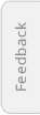
The above illustration highlights the fact that the indicator lags price action, that is, it's always behind the price. Therefore, when prices are not trending, moving averages can give misleading information. In order to reduce the lag, technicians created an array of other moving averages, the most common being the mentioned exponential and the weighted moving average. EMAs reduce the lag by applying more weight to recent prices relative to older prices, and the WMAs put more weight on the most recent data and less weight on the older data.
For a detailed view about the formula for an exponential moving average, please check the report 'A Practical Guide to Technical Indicators' by S.A. Ghafari.
At a first glance, the difference between an exponential moving average and a simple moving average looks minimal. Nevertheless, the exponential moving average is consistently closer to the actual price when it is trending.
Which moving average to use will depend on the concept you base your trading method on, as well as how the specific currency pair has reacted to it in the past. The simple moving average obviously has a lag, but the exponential and the weighted moving average may be prone to more volatility and will generate more false alerts. So your role is to take these aspects into account or even think about ways to take advantage of it. Some traders prefer to use exponential moving averages on shorter time frames to capture incipient trends, while others prefer simple moving averages over large time spans for longer positions.
A very popular exponential moving average explained by Rob Booker: Using the 62 Exponential Moving Average in Currency Trading.
A perfect moving average should therefore have a minimal lag when the price starts trending and at the same time be smooth enough when price action is range bound. But there is no such perfect moving average and we need to favor one attribute at a time: either smoothness or sensitivity. In fact, there is no perfect technical indicator, all of them produce the so called 'false' signals.
As a first approach to any indicator you should experiment with it by plotting it on a chart and play with different settings in order to get a feel between the sensitivity of the indicator for a specific currency pair and its reliability as signal generator. Let the dilemma of the sensitivity and the reliability for the analysts: as a trader, your purpose is to find a tool which can help you interpret what you are already seeing in the price action.
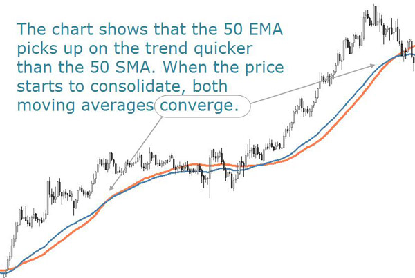
The above EUR/CAD chart doesn't tell you much? Indeed, a moving average alone is probably not the best choice to build a trading strategy. Prior to the decline, the price gyrated above and below its moving average. After the decline, the pair continued its erratic behavior without developing much of a trend, giving no clear signals on what to do and how to profit from the price action.
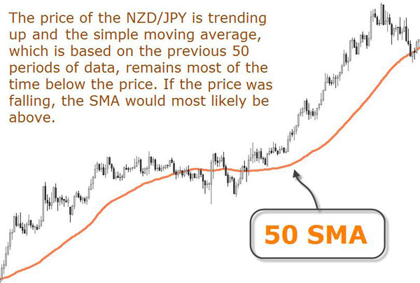
What about adding a 50 EMA to the chart and use the two moving averages in order to provide entry signals?
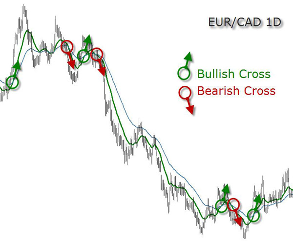
Keeping the same chart, we can see the exchange rate trending inbetween periods of consolidation. It is sometimes difficult to determine when a trend will stop and a trading range will begin. But notice the trading range periods, the breakouts (both up and down) and the trending periods. Also observe the direction of the moving average crossovers and how they could have been used to point to the direction of the trend.
The faster moving average, which is measured over the shorter period of time, may be used as proxy for price and thereby eliminate the short-term fluctuations in price action. Technical analysts consider the crossover of the fast average above the slow average as a bullish signal and the crossover of the fast average below the slow average as a bearish signal.
There are many formulas to calculate averages. For a detailed explanation on the modified exponential moving average, please read the related article.
Moving averages also form the building blocks for many other technical indicators. This is the case of our next indicator, the moving average convergence divergence (MACD).
Oscillatiors: the MACD
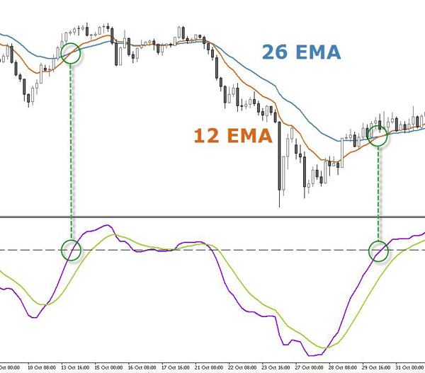
The MACD may be interpreted similarly to other moving averages and used as a trend-following indicator. That is, when the MACD crosses above the MACD signal line, it's a bullish signal, and conversely, when the MACD crosses below the MACD signal line, a downtrend may be beginning and the signal is bearish.
Its default settings are usually 26, 12, 9 and there are its components:
1. The MACD line takes a short length and a long length exponential moving average (defaulted to 12 and 26) and calculates the difference between these two averages.
2. A signal line is an exponential moving average of the MACD line. This is plotted as the MACD signal.
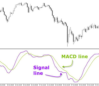
3. The third element is the median line also called 'zero line' or 'center line'.
The MACD moves around a center line and it has not upper or lower limits as other oscillators have. It is thus called an 'open oscillator'. The median line represents the point at which the moving averages are equal.
If the EMAs which compose the MACD cross a bearish signal, the indicator translates it into a simultaneous bearish crossing of the MACD line with its median line. And vice versa, when the MACD line crosses its median line to the upside, this means the two EMAs built in the indicator are crossing upwards.
4. Finally, the difference between the MACD and the MACD signal line is calculated and plotted in a histogram.
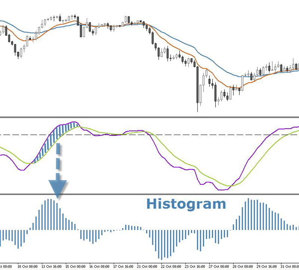
If you are going to use the MACD, consider including the histogram as well. On occasion, the MACD itself may be following the price nicely, but the histogram can alert the trained analyst that a turn in price is in the air by giving signs of divergence. What a divergence is will be explained further below.
The same dilemma as for the moving averages applies for the MACD: shorter moving averages will be more sensitive and generate more crosses, and longer moving averages will always lag price and generate fewer signals.
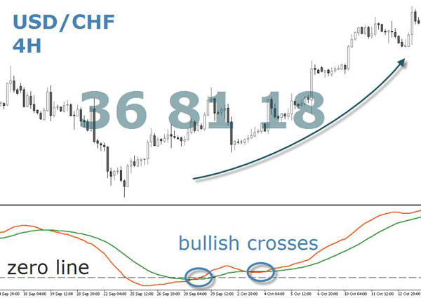
Why then not change its default settings and do something creative with the MACD? The signals provided with the settings 36,81,18 may be few, but are they therefore less reliable? Note how the below settings evidence the start of a trend when the MACD line crossover is close to its median line. You may ask where this weird numbers are coming from. The answer is that they are multiples of 9.
The MACD is based on the concept of convergence-divergence. But what is the convergence-divergence of a moving average? We have said the MACD consists of two exponential moving averages that range around the median line. The result is an indicator that oscillates above and below that line.
When the MACD is above the median line, this means the 12-period moving average is above the 26-period moving average, indicating that recent prices are higher than the previous ones.
Conversely, when the MACD is below the median line, it means the 12-period moving average has a value of less than 26 periods, indicating that prices are falling.
In other words, the bigger the spread between the two EMAs taken into the equation of the MACD line is, the more distance the indicator will print to its median line.
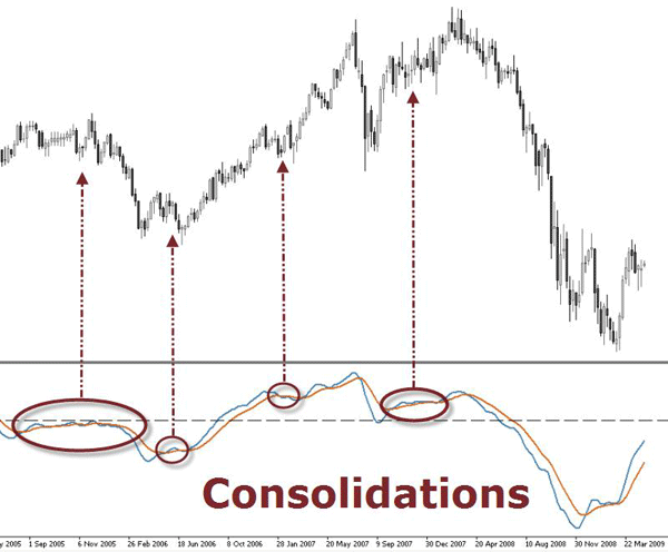
When a currency pair is volatile, the MACD shows broad movements on both sides of the median line. However, when the market is calm, its moving averages converge and the MACD line takes a break close to the median line.
This feature makes the MACD indicator useful to measure the speed and volatility. Notice how each volatility boost starts after a period of consolidation.
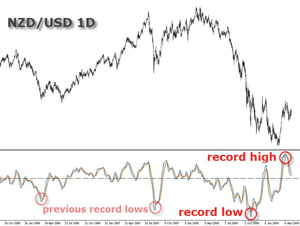
The MACD indicator is an open indicator which means that overbought and oversold conditions are relative to previous highs and lows of the MACD line.
Being an open indicator implies that, unlike other oscillators with values ranging from 0% to 100%, in the MACD there is no maximum or minimum value. Since the EMAs forming MACD can't theoretically distance from each other ad infinitum, there is logically always a return of the lines towards the median line. To identify periods of overbought and oversold conditions, we must look at past figures in the range of values which the MACD has registered.
Technical indicators work particularly well when combined with each other. Besides, they also perform well with different settings than the default ones. A proof of it is the below illustration.
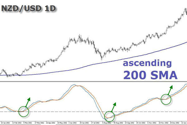
A 200 SMA has been displayed on the chart, combined with a MACD using the following settings: 21, 55, 8. You may ask again where these weird numbers are coming from. The answer is they belong to the Fibonacci sequence. The next section will cover the sequence in more detail, but for now just observe how an ascending 200 SMA acted as a filter for the signals generated by the MACD crossovers. The purpose was to go with the trend, therefore no bearish cross was taken as valid.
Do you conceive the MACD or even moving average crossovers as the only way to determine the overall trend in your analysis? It's true these are great methods, but they always produce series of losses, specially when the market is consolidating.
There is another method which enables traders to profit from consolidation periods, and this is done by identifying divergences between price and the MACD lines.
One of the things traders look for are signs of convergence and divergence between price action and the indicator. A convergence is when the indicator and the price action are hinting a similar signal and, therefore, reinforcing their signals. But when the indicator and the price are telling a different story, there is a divergence, showing that price is not supported by the indicator.
There are basically four types of divergences, which can be identified with the MACD or any other oscillator (Stochastic, Momentum, RSI, etc.). Divergences, like its name suggests, happen when the price and the oscillator go in opposite directions, hence diverging from each other.
The four types of divergences are:
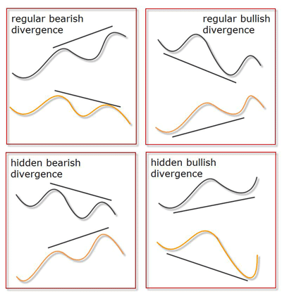
A regular divergence simply means one of two things - that price has made higher highs while the oscillator has made lower highs (this is the case of a regular bearish divergence), or that price has made lower lows while the oscillator has made a higher low (a bullish divergence).
A regular bearish divergence is a sign that an upside momentum may be failing and that there may be an impending downturn, while a bullish divergence, on the other hand, is a sign that downside momentum may be exhausted and may be interpreted as a warning of weakness of the trend.
Hidden divergences, in turn, are signs of trend strengthening: when price has made a higher low while the oscillator has made a lower lows (this is the case of a hidden bullish divergence), or that price has made lower highs while the oscillator has made a higher high (a bearish hidden divergence).
The MACD histogram, which is the difference between both MACD lines, can also be used to confirm MACD divergences. As such, if it is divergent to price, it can suggest the move is running out of steam.
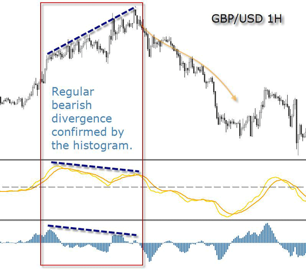
Use the MACD and the histogram to find divergences. A double confirmation provided by both indicators will filter out some false signals and enhance the odds in your favor.
The GBP/USD plays out regular divergences very frequently. An observed pattern takes place on Friday afternoons when the London session is about to close. London session traders closing their positions and taking profits on Friday afternoon makes the pair trigger regular divergences against the prevailing weekly trend.
Why some strategies that are so effective during the week seem to fail on Fridays? Remember: London is responsible for about one third of all the Forex volume. This means that 2 PM on a Friday in New York is already late afternoon in London, and London traders are closing their positions for the week. At the same time it is already Saturday morning in Asia, so we can't expect any volume from that part of the world. The closing of London positions in a less liquid environment - due to the absence of Asian traders - gives way to violent price reversals and erratic moves.
It is recommended to close short term positions until Monday and avoid to open new trades on Friday afternoon London time. In any case, it will depend on the strategy you're using. If you take the above edge and focus on profiting from the closing of London positions, then Friday might be a good time to trade.
Divergences should not be seen as all-encompassing, self-sufficient trading strategies. They can certainly be reliable but they should only be used in tandem with another confirming factor such as S&R analysis or another technical indicator, in order to get firm confirmations of market reversals.
Fibonacci Scale
Leonardo Fibonacci explained the exponential growth in nature through a well-known number sequence. In this sequence each number is the sum of the previous two consecutive numbers.
The sequence starts with 0 and 1 and goes on with: 1, 2, 3, 5, 8, 13, 21, 34, 55, 89, 144, 233, 377, 610, 987, 1597, 2584, etc.
To learn more about the Italian mathematician Leonardo Fibonacci, you can visit Wikipedia.
Fibonacci proved that this sequence can be manifested in the evolution of a natural growth phenomenon, as a solution to a mathematical problem based on the reproduction process of a pair of rabbits. However, the utility of the sequence lies in its fundamental properties, discovered in the eighteenth century:
1. When dividing the consecutive numbers of the sequence, ie: 1/1, 1/2, 2/3, 3/5, 5/8, 8/13, etc., the result tends to approach the number 0,618.
2. When dividing the non-consecutive numbers of the sequence, ie, 1/2, 1/3, 2/5 3/8, 5/13, 8/21, etc., the result is the number 0,382.
3. The ratio of any number of the sequence in relation to the next lowest number, ie: 21/13, 13/8, 8/5, tends to be 1,618.
4. The ratio of any number of the sequence in relation to the next lowest non-consecutive number, ie: 21/8, 13/5, 8/3, tends to be 2,618.
The difference between the ratios and the result of the equation is greater when the the numbers used in the series are smaller. For example:
144/233 = 0,618: the result of the equation is a precise Fibonacci ratio.
144/89= 1.6179: with a smaller number the result of the equation only comes close to the Fibonacci ratio.
The 1,618 ratio and its inverse, the 0,618, were called by the ancient Greeks the 'golden ratio'.
Traders are not so interested in the numbers of the sequence as in the ratios between the numbers. These ratios can be used to identify support or resistance levels, find the targets for price movements, or even to determine the time period that a movement will last.
The most popular levels or ratios are:
23.6%, 38.2%, 61.8% and 161,8%
The 100% which is the full size of the movement to be analyzed and its half, the 50%, are commonly added to the Fibonacci levels, although they are not ratios of the sequence.
It's common to see a price correction towards a Fibonacci level after a clear trend has been developing. This doesn't mean that a price correction is to halt accurately at these levels, but most of the time price will slow down or interrupt the directional move and find temporary support and resistance at a Fibonacci level.
In a study titled 'Using Fibonacci to determinate market goals', Facundo Molina analyzes past market data in order to prove objectively that a combination of the Fibonacci retracements and the ZigZag oscillator will determine with more than 70% of accuracy the target zones where prices will go.
As a conclusion of his work, he proposes to use Fibonacci tools in intermediate time frames as an excellent tool for short term technical traders.
Part II: Fibonacci's applications
Part III: Application in the Objective Market
Part IV: Model's description
Part V: Model's description (cont)
Part VI: Final Results and Conclusion
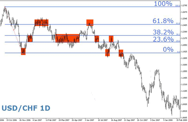
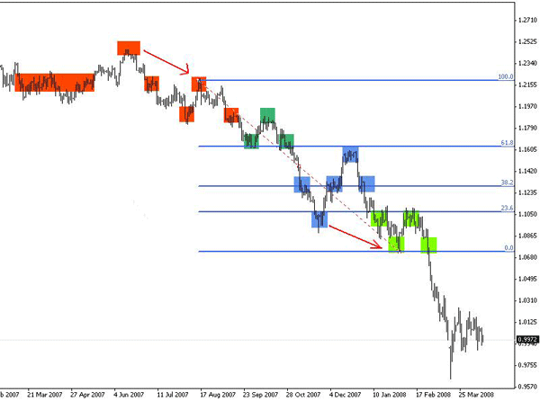
Although very useful, Fibonacci ratios are not less subjective than any other tool used in technical analysis because it leaves some room for interpretation and personal preferences. However, this subjectivity is relatively easy to handle, and the charts below illustrate this flexibility and adaptiveness.
In this daily USD/CHF chart, the Fibonacci tool is anchored in the extremes of a trend that lasted about a month in late 2006. For nearly a year, prices were consolidated at the 23.6%, 38.2%; 61.8% levels. The 50% level has been omitted here for more clarity, but we encourage you to include it in your toolbox.
In the next chart, the anchorages of the Fibonacci tool were moved when the price reached new highs and lows. Observe how the old consolidation levels are mostly coinciding with the new levels, despite the fact they are dislocating the tool.
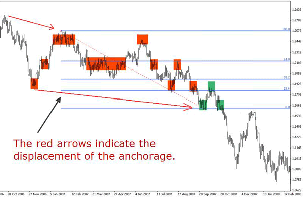
In the next chart, the upper anchorage is simply displaced in time but remains at the same price level. In contrast, the lower anchor has been placed at the new low reached by the price. Again, observe how the price takes into account the new Fibonacci levels.
By moving the tool to the newest extremes, we are also segmenting the chart into smaller sections, which in turn can be used as entry or exit points, or just as levels to adjust a trade size.
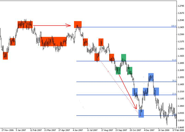
In the next chart, despite the Fibonacci tool has been displaced down, the previous consolidations match with the new levels - what was before 23.6% is now 38.2%, for example.
This is not a coincidence, but rather how this analysis works and how the price tends to respect the Fibonacci ratios. Specially stronger consolidations tend to remain clustered at key Fibonacci levels.
Andrei Pehar says that using this tool is easier than to pronounce the word Fibonacci. He reaches a similar conclusion with a simple pattern, yielding a powerful 77% win ratio: Institutional Trading Strategies: The ABCs of Fibonacci.
Our Fibonacci calculator can be a useful tool to help you in your analysis.
John Jagerson, in this video titled Using fibonacci retracements to identify support and resistance, goes into intermarket Fibonacci analysis and Fibonacci time series. Using Fibonacci levels to project price targets and timing is another recorded session worth watching too.
Pivot Points
As Raul Lopez explains in an article published in 2006:
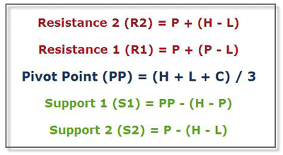
Pivot points, a technique developed by floor traders, help us see where the price is relative to previous market action.
As a definition, a pivot point is a turning point or condition. The same applies to the Forex market, the pivot point is a level in which the sentiment of the market changes from 'bull' to 'bear' or vice versa. If the market breaks this level up, then the sentiment is said to be a bull market and it is likely to continue its way up, on the other hand, if the market breaks this level down, then the sentiment is bear, and it is expected to continue its way down. Also at this level, the market is expected to have some kind of support/resistance, and if price can't break the pivot point, a possible bounce from it is plausible.
Pivot points work better on highly liquid markets, like the spot currency market, but they can also be used in other markets as well.
The great advantage of a technique based on pivot points is the fact that this tool is based on price action (high, low and close of the day) and doesn't lag price as most technical indicators do. For some strategies, the signal of any lagging indicator could come too late, when the motion to capture is already accomplished. As a disadvantage, one could see this tool's inability to adapt to price changes throughout the day since its the previous day's data which establishes the pivot point for the next day.
Pivot Points can be applied to any time frame, but they are mainly used to identify the intraday directional bias as well as significant support and resistance levels. For that reason they are best visualized on intraday time frames. Although pivots are calculated based on the previous day, they may be calculated on weekly or monthly data.
Since the Forex is a 24hr market there is an eternal debate on deciding at which time the open, the close, the high and the low from each 24-hour cycle should be taken. Nevertheless, the majority of traders agree that the most accurate predictions are achieved when the pivot point is adjusted to the GMT or the Eastern (New York - EST) times. That is made by taking the open at 00:00 GMT and the close at 23:59 GMT, or by taking the open at 00:00 EST and the close at 23:59 EST.
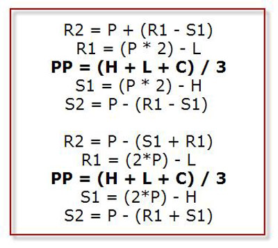
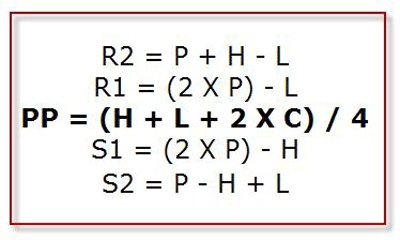
There are variations of this formula, where support and resistance levels are calculated differently, leading to slightly different results. Here are some of these variations of the original formula:
Some charting platforms also integrate the (S3) and (R3) within the pivot point formula, which is useful for volatile pairs such as the GBP/JPY. Other platforms calculate intermediary levels too, called (M), which also provide additional information to the main levels. The latter is useful after some days of high volatility as the S&R levels are very distant from each other.
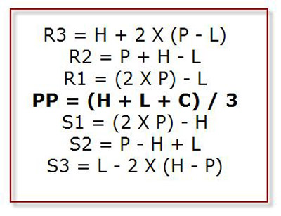
The so-called 'Woodie' pivot points are similar to the standard ones, but with a slight variation in the calculation of the PP, which gives more weight to the closing price of the previous period.
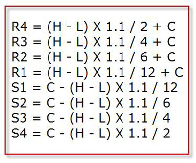
The 'Camarilla' pivot points is a series of eight S&R levels which are used for the same purpose as the other applications: to identify S&R levels for a certain period of time.
Don Dawson offers an interesting perspective about why pivot points work so well in today's electronic markets, even if they were originally created in a time when such devices didn't existed:
The numbers worked so well when they first came out. Then like many trading ideas in the markets, everybody started using them and they lost some of their strength. Also, people started using them thinking that they were going to be the "exact" projected High or Low of the day and the study was used improperly. This just caused more opportunities for the floor traders to fade these levels where the public would Buy or Sell blindly on these numbers. You see, back then we only had a handful of technical studies to look at and a lot of traders. Today, we literally have hundreds of studies to look at. For this reason I believe that some of the more traditional studies are starting to work well again. With much more variety to trade from, the idea of too many people using one tool is not as likely.
Other technical indicators, such as Bollinger Bands, RSI, Stochastic, etc., are explained in this Forex Indicators Manual by Doug Schaff.