2. Identify support and resistance on a chart
In this section we are going through the basics of support and resistance lines. S&R lines conform the most basic analytical tools and are commonly used as visual markers to trace the levels where the price found a temporary barrier. In other words, where price had trouble crossing. These levels can be found on any chart and any time frame either 1 minute or 1 month. Some of these lines remain valid for years.
Lines are very powerful tools for the analysis because they trace significant price levels at which traders will take action. This increases the probability of anticipating the course of the exchange rate. Usually, the higher the time frame where a line is displayed the stronger it will be in terms of capitalizations and impact. But even on a 1 minute chart you can find and act upon them.
Horizontal support and resistance lines
To draw a line you need at least two contact points where price has bounced. These points are highs or lows registered on the chart. The more contact points a line has, the more traders will be watching it as a significant level. If a line has solely two points of contact, or if these are not really bounces, the majority may not take it into consideration and the breaking of the line may not have a big impact.
As you see on the chart below, some lines have acted as a temporary barrier where price came to touch it, even pierced it, and eventually crossed it, whereas other lines acted as a more permanent barrier where price was clearly rejected. Candlesticks already evidence those levels with their bodies and wicks, but lines make it even easier to see.
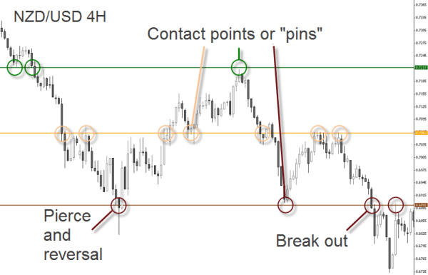
Some lines can last for years and remain active in the present, even when most of today's market participants didn't contribute to form that line in the past. Prepare yourself to identify lines from the 80's and 90's when charting in longer time frames!
The chart below is a monthly chart showing the price action on the USD/JPY. As you can see, many levels hold for several years, therefore we can expect them to remain active in the future. The best you can do when starting to draw lines is to color code them as all-time highs and lows, as well as primary and secondary S&R levels.
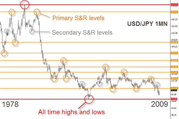
Higher time frames offer a good perspective on the most relevant S&R levels, because they show the main barriers. But you still have to do the same on lower time frames to find more accurate levels. From the chart above you can already notice that some recent high and low swings have slightly migrated in comparison to the earlier ones. You can solve this by zooming at lower time frames. Ideally you should switch to the weekly time frame, but we are jumping straight to the daily so that you can see a complete new world.
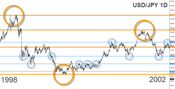
Do you see all these intermediate levels shown by the blue lines and circles? Note the above chart is a daily chart. These intermediate levels were barely visible on the monthly chart shown before because of the time compression. When switching to lower timeframes, secondary support and resistance levels which were not visible on the higher timeframe appear.
The conclusions we arrive from this top-down approach in timeframes is that higher timeframes offer a general view on the most important S&R levels, while lower timeframes show intermediate levels more appropriate to short term trading.
Remember: lines on a chart are just interpretations of what is going on in the market. The market is not composed by lines, they are therefore reductions of all the information the market contains.; a reduction allowing us to read and interpret the reality without going mad.
To draw and work effectively with S&R lines, there are no generic nor 100% objective rules. In trading, it's useless to strive for certainty all the time - in fact, it's not even necessary as you will understand during this course. Knowing that you can't be right all the time, the best you can do is to establish certain rules in order to reduce the impact of your mistakes. As to how develop such rules you will be geared with some guidelines during this chapter.
The only secret to identify and draw S&R lines is to accumulate hours of practice. Only through practice - watching experienced traders tracing their lines and following analysts using them - you will be able to see the lines in formation and even anticipate some price movements with their help. At first it's a daunting task but with time you'll see that it is very simple.
Lines migrate all the time and must be therefore adjusted on the chart. They move slightly some pips up or down. If a group of participants, representing enough supply or demand, decides to open or close their positions some pips above or below compared to what other players did in the past, that line will migrate some points on the chart. You will notice that these movements are not huge. If there is a completely new level where price got rejected, then you are probably witnessing the birth of a new S&R level, but this is not usual. What happens is that S&R levels become more or less important as market swings.
It is also common sense that S&R lines should show some distance between them. There is no rule as for the distance between two lines, but you should let some decent room between them, otherwise it would negate the whole purpose of their use.
Shall I use lines to spot breakouts or trade reversals instead? Great question indeed! You may use them as you prefer. Entering the market after a breakout is probably a more reactive attitude, while expecting a bounce at a significant level is more a deliberate attitude. Both strategies can be very accurate and effective if well developed into a trading method.
You can also use S&R lines as targets for your trades, while the entry signals are given by a technical indicator, for instance. Using them as targets is one of the reasons why price reacts to them. Remember: to exit a position is technically also an execution order. The market will react to it, be the exit made of a market order, a limit order or a stop loss order - the market doesn't care.
Finding turning points
The contact points between price and S&R lines are often formed by swing lows (for an uptrend) or swing highs (for a downtrend), often called reversal points. When using Japanese candlestick charts, you can use the wick or the body of the candle as a guide to trace your lines. There is really no fixed rule how to draw lines. Some analysts sustain a rebound at the wick is usually more valid because it corresponds to an actual swing high or swing low on the chart. Others prefer drawing trendlines using the closing prices arguing that these hold more significance than intraday spikes as observed on candlestick charts. In a 24hr market such as the Forex, closing prices (on daily time frames) lose a bit of interest thought, as there are several closing prices depending on the geographical trading session.
A correct identification of a contact point indicates the strength that the line has at that level, given primarily by the size of the rebound.
If there is a clear trend in the price movement before the price touches the line, this becomes more notable and consequently the support or resistance level it represents too. What's more, if the price action shows a trend after the contact, the S&R level deserves a special attention as it is showing a clear rejection of that level.
By the way, a trend is made by a series of candles showing directional price momentum. This is clearly seen when price makes successively higher highs or lower lows.
The picture below shows two interpretations of the same support level with clear trends before and after the reversal.
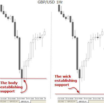
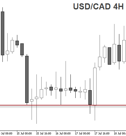
The next example shows a support level confirmed by wicks, also called "shadows" AND bodies of a series of candles. Notice how sometimes the price reversed exactly at the support line, touching the line with the candle wick, while in other occasions the price penetrated the level but retraced in order to close the candle precisely at the support level.
The Forex market is known to have long lasting trends. But even so, trends are not always evident from the beginning. It's obvious traders want gratification when they buy or sell. This is something a shallow trend can never fulfill because price most often corrects itself before ramping to new swing highs or lows, apparently never gathering enough momentum to accelerate the trend. This less attractive price action makes traders lose interest and jump ship in search of a more exciting trading pair. As a result, market loses broad sponsorship and price action shows a reversal in the exchange rate or a stagnation.
When you develop a trading method, it's important to formulate your own definition of what is a trend or a trending condition. This will depend on the timeframes you use, the tools used to track price action, and definitely your trading style. At this stage, when approaching price action and learning how to read it, it's convenient to start differentiating analysis from trading. Your goal is to become a trader, and the analysis is going to be just one of your resources. Amongst the tons of analytical tools and methods available out there, first you have to be selective with the tools you choose and second you should go beyond the chart interpretation in order to develop a trading method.
Valeria Bednarik shares with us her proceedings when identifying trends:
Primary trend, Secondary trend and Correction movements
Generally, inside the same chart, you can see different trendlines. One of them will probably define primary trend, others the secondary and so on.
In any big chart, daily or weekly, we see there are corrective movements that in fact are small descendant trends of a minor range. In smaller charts, like one hour ones, we will find out that there are small bearish trends against the bullish major one. So how can we solve and understand all these lines? Well the answer here is to use one basic rule: we set our primary trend in the following bigger chart than the one we use to trade, meaning that if for example we trade 1 hour charts, we will set our trendlines in a 4 hours chart.
In the case we are daily traders, meaning we use daily charts to analyze a buy or sell signal, then we will have to define our primary trend in a weekly chart. If the weekly trend is bullish, we should try to trade buying, taking advantage of valleys or corrections we can see in daily charts. If we work with one hour charts, then we must look for the primary trend at daily or 4 hours charts, and use valleys and corrections of one hour to trade.
What is the best way to identify a possible bottom for a downtrend in terms of a daily chart or an hourly chart?
Alberto Muñoz, aka FXWizard, answers in FXstreet.com forum:
Here's my counter-attack: "never try to pick tops or bottoms in any financial market"
Anyway I'll tell you what it works for me...
Never use RSI or Stochastic to pick market top/bottom, those indicators don't work because everybody know them. I found that StoRSI, and its derivative, the DT Oscillator (created by Robert Miner) work smoothly so could use it instead.
Also you can use the ADX as I have suggested in another post (it's a good reference) or even the mass media headlines: as I have read the papers this morning I thought that today we would see a strong rebound in the equity markets as well as in the USD, in spite of the opening panic (if you don't believe it, why did the GBP rally against USD today?)
Finally one of my favorites is candlestick patterns: when you see a black candle, and after that, a doji or a spinning top and then, a big white candle whose close is clearly above the first black candle, you can bet it's likely that we have made a bottom.
Of course there are a lot of other techniques that may catch the turning point of the markets, but the ones above are the best for me.
Anyway remember I don't believe in picking extreme values, you have to play other cards to win in the trading game.
Dynamic S&R trendlines
The so-called "trendlines" or "dynamic“ S&R lines are also essential tools in the analysis of charts. Unlike the horizontal lines, which are identified with a certain quotation, the dynamic lines contain a range of quotations. It's not so much the price level which is here considered as relevant, but rather the line itself.
They are as easy to spot and draw as horizontal lines: at least two contact points are needed to form a dynamic line. The first contact point should be an obvious support or resistance level and act as a hinge. By identifying a second rebound in price, we have the second point of contact and we can draw the line.
During a trend, the exchange rate registers new lows or new highs. In a bearish trend, for example, the price reaches new lower highs and lower lows. This downward movement can be visually tracked with a sloping resistance line on the chart, which we call trendline.
In the weekly chart below, two trendlines are clearly acting as resistance. The upper line remained untouched for more than 6 years, and yet it was called to live when price finally broke the lower resistance trendline and rose all the way up to meet the next barrier. This explains why some lines should remain on your charts forever from the first day you draw them.
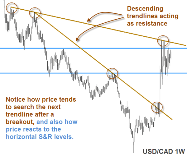
Only 2 contact points are needed to draw a line but in the example above, both trendlines show 3 contact points. What does it mean? This means the area extending between both descending trendlines was already visible on the chart in April 2007 , whereas the breakout occurred in late August 2008. This is a long time of preparation for a great trade of more than 2,000 pips!
As you see from the above illustration, while trendlines are a basic and simple tool, they can also be one of the most powerful forms of supply and demand analysis.
This is one of the many recorded webinars on support and resistance trading given by Rob Booker: Longer-term Support and Resistance Trading: Setups and Rules
For your further study, you can watch the complete series called "Longer-term Support and resistance Trading: Setups and Rules"
The excellent contributions of Ross Yamashita on his blog will provide you with a deeper understanding on the market cycles. Check out his Elliot Wave analysis from time to time and contrast your own charts with the levels he draws: The Trader's Edge blog


